Modding:Inkscape for LT: Difference between revisions
Sightglass (Sọ̀rọ̀ | contribs) Drawing section, through LT Tips and Tricks subsection |
Sightglass (Sọ̀rọ̀ | contribs) |
||
| Line 92: | Line 92: | ||
Given the limited size available to icons in-game, not only is choosing which details to include important. It is also important to choose how some details are emphasized over others. This is easily done with stroke thickness. In general, the outline of an object has the thickest stroke, and details get smaller strokes the smaller the detail. | Given the limited size available to icons in-game, not only is choosing which details to include important. It is also important to choose how some details are emphasized over others. This is easily done with stroke thickness. In general, the outline of an object has the thickest stroke, and details get smaller strokes the smaller the detail. | ||
[[File:Shorts and Line Weight.png]]In this example, the outline of the overall object is '''1 thickness'''. The belt loops, wrinkles, and internal seams are '''0.5 thickness'''. I generally try to use only two or three different thicknesses so that it is easier to keep track of groups of lines. Stitching can be either the same thickness as the outline or the internal details, depending on what looks better for the object. Some clothing has more visible stitching than others. In this example, the stitching is between the two, at '''0.75 thickness'''. | [[File:Shorts and Line Weight.png]]In this example, the outline of the overall object is '''1 thickness'''. The belt loops, wrinkles, and internal seams are '''0.5 thickness'''. I generally try to use only two or three different thicknesses so that it is easier to keep track of groups of lines. Stitching can be either the same thickness as the outline or the internal details, depending on what looks better for the object. Some clothing has more visible stitching than others. In this example, the stitching is between the two, at '''0.75 thickness'''. | ||
Revision as of 04:32, 29 February 2024
[This document was originally written by Solace (solace2358) on the LT Discord. It has been adapted to wiki markup.]
Don’t use the autotrace feature.
This guide explains some aspects of XML files associated with SVG images, but for the most part XMLs can be learned about from the templates in LTs game files.
Canvas size for LT SVGs should be 256 x 256. If you open an SVG file in notepad or other text-editing apps, you can see the data that builds the image. Among that data, you should see: viewBox="0 0 256 256"
Viewbox errors lead to the image not being properly sized or placed in the item box in-game. The easiest way to avoid this is to save an existing SVG file under
Setting Up
Color Palette
Clothing can be coloured any way you like, but if you'd like the player to be able to dye your clothing, you can specify available colors.
PrimaryColours, secondaryColours, and tertiaryColours can all spawn in as a default color, while their 'Dye' counterparts are only available if the player chooses to dye the clothing in that color. The game detects specific color values, and recolors them to the value chosen by the player.
These values are as follows:
| Red is used as base color for changing the primary color of the graphic in-game, and for most items the game will only recognise and change the following colors: | Orange is used as base color for changing the secondary color of the graphic in-game, and the game will only recognise and change the following colors: | Yellow is used as base color for changing the tertiary color of the graphic in-game, and the game will only recognise and change the following colors: |
| #ff2a2a | #ff7f2a | #ffd42a |
| #ff5555 | #ff9955 | #ffdd55 |
| #ff8080 | #ffb380 | #ffe680 |
| #ffaaaa | #ffccaa | #ffeeaa |
| #ffd5d5 | #ffe6d5 | #fff6d5 |
The darker the shade of each color is in the SVG file, the darker the color applied in-game will appear. This can be used to apply shadows as well as indicate depth. Typically, the closer something is to the foreground, the brighter the shade will be used, and the farther something is from the foreground, the darker the shade will be used. Example:
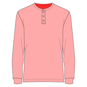
The specific values for weapons and patterns are slightly different. All of the necessary colors for LT are in a document in my Google Drive, next to this tutorial document, called “lt-colors.gpl”.
After downloading that .gpl file, you’ll need to add it to InkScape. The likely file path for this is:
Local Disc (C:) → Program Files → InkScape → share → inkscape → palettes
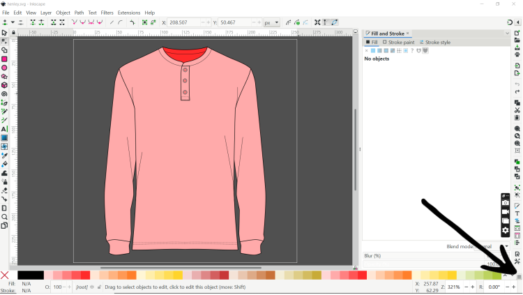
Place the “lt-colors.gpl” file inside of the “palettes” folder, and open InkScape. In InkScape, click the 3 horizontal lines icon at the bottom right of the workspace.
A list of available palettes will appear. Find and select “Lilith’s Throne.” Now the available colors at the bottom of the workspace should be as they appear in the image above. If you hover the cursor over any of the colors, it will tell you what type of item in LT it is meant for, and whether it is Primary, Secondary, Tertiary, or Damage Type (for weapons).
With any object selected in InkScape, you can left-click on a color from the palette to fill the selected object with that color. You can also right-click on the color in the palette list to fill the stroke of the selected object with that color.
Drawing
Fundamentals
InkScape is a vector-based drawing software. The file format for vector images that LT uses is “.svg” which stands for “scalable vector graphic.” Vector images are scalable because they are defined mathematically. As a result, no matter how much you scale a vector image up or down, it will look the same.
Comparatively, most digital artists are familiar with raster images. These are constructed out of pixels which are not naturally scalable. If you scale a raster image up, it will appear blurry as it tries to add pixels between the ones that are already present. If you scale a raster image down, it will lose pixels and become far less clear.
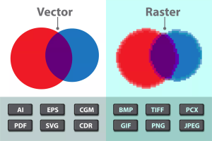
Additionally, a well-optimized vector image will have a much smaller file size than standard raster images and impact the loading time of LT far less.
General InkScape Tutorials
The following links lead to basic tutorials written by the developers of InkScape:
LT Tips and Tricks
As a reminder, the smaller the file size of an SVG image, the less of an impact it will have on the loading times of the game. Another thing to keep in mind is that while vector images are infinitely scalable without losing detail, the actual icons shown to the player in the game are only so big. Oftentimes, it is easy to remove excess detail from an item icon and still communicate the core features of the item.
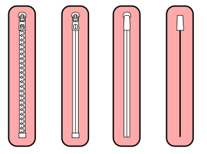
One such detail is zippers. Below are examples of simplification of a zipper. The image on the right is representative of the scale that the zippers would be visible in-game, especially as a detail on a pocket or zipper fly.
 |
 |
The simpler designs still communicate the imagery of a zipper, but have far fewer nodes and thus less information to calculate.
Even though vector image files are already generally smaller than raster image files, there still exists some comments and metadata inside the .svg files from InkScape whose information is not necessary to run in LT. When you have completely finished with a drawing for an item icon, the file should be optimized.
Optimization can be done directly from InkScape. To do so, save the file as (ctrl+shift+s), and then in the drop-down box for file types to save as select “Optimized SVG.” A box will pop up with configuration settings for your optimized SVG.
- Under the Options tab, uncheck the box labeled “Collapse groups.”
- Under the IDs tab, uncheck the box labeled “Shorten IDs.”
- If you plan on making clothing which can have patterns applied to them, then type “patternLayer” into the box labeled “Preserve the following IDs.”
Those settings will stay the same in the future, so you only need to make those changes once. Your new optimized SVG should be anywhere from 25-50% smaller than it was before.
Given the limited size available to icons in-game, not only is choosing which details to include important. It is also important to choose how some details are emphasized over others. This is easily done with stroke thickness. In general, the outline of an object has the thickest stroke, and details get smaller strokes the smaller the detail.
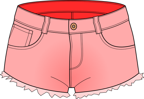 In this example, the outline of the overall object is 1 thickness. The belt loops, wrinkles, and internal seams are 0.5 thickness. I generally try to use only two or three different thicknesses so that it is easier to keep track of groups of lines. Stitching can be either the same thickness as the outline or the internal details, depending on what looks better for the object. Some clothing has more visible stitching than others. In this example, the stitching is between the two, at 0.75 thickness.
To make modifying your objects easier, I recommend going into:
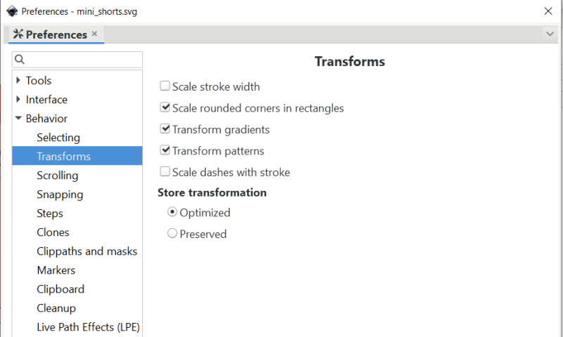
edit → preferences → behavior → transforms
and unchecking “scale stroke width.” This will keep the stroke thickness the same regardless of scaling the object. Otherwise, you will end up with different stroke thicknesses containing values with several decimal places.
